Welcome to the new version of the Black Sabbath Online website. This has been a long time coming. For a couple of reasons.
- The old site has been here a long time. It’s served me and the community well, but it was launched in January of 2000, and given this is January 2012, TWELVE years later, it has been overdue for a fresh coat of paint. There’s also a few parts of the old site which are just broken, and needed replacing. It was definitely TIME. To those who said “What’s wrong with the old site, leave it alone?” – that’s most kind. But it needed a refresh. It was a 12 year old site design.
- It’s taken me quite some time to get this updated – I originally started work on this new iteration of the site in late February, early March of 2011. As this site is a fan site, and is 100% under my control, I was under no real pressure to launch it. I do the site in my spare time, so I’d work on it when the mood struck.
The biggest delays I suppose were due to the fact that the new site is in WordPress, which is pretty good and powerful blogging software, that can double as a CMS as well. Being in WordPress allows me to be more flexible with what I can do. I also do the Bill Ward, Geezer Butler, Cozy Powell, & the official Heaven and Hell sites. ALL of those are in WordPress as well, so it allows for a lot of flexibility. BUT.. You have to get the info in there. As most people who have followed my site for awhile know, there’s a lot of info. That was an issue here, as I had to mostly hand re-recreate all of the pages. The only bit that I could automatically import into the new site was the news archives. And even then, I didn’t have everything in.
All the discgraphies, interviews, band pages, etc were all old hand-created Frontpage pages, and they couldn’t be imported into WordPress. I had to create ’em from scratch. A major hassle, I admit, and that was borne out by how long it took to get the thing together. But in the end it worked out, as it’s now all in there, and far more easily manipulated.
The site originally started as a Microsoft Frontpage site, and then I converted to another blogging tool, Movable Type. As the site grew, I just went with what I knew. When I switched to Movable Type for news, I imported some of the old news, but I got bored of that, and never converted the REALLY old news. For this site update, I didn’t want to leave that behind, so I put out the call on Twitter for help, and one fellow helped out. Guy by the name of John Swanner really stepped up there, manually entering about five years of old news archives, so he deserves a big thanks.
I’m going to go down the list of features here and how it compares to the old site. There’s a lot of changes obviously. There’s also a bunch of random oddballs that were just put elsewhere, I’m detailing all of that (like the “Who Are these people” page, and the “Ozzy on Mob Rules?” page) – the latter ended up on the Mob Rules discography page. This is just major changes, not where every character on the old site went. :)
New / Changed Stuff
- The Site’s look – This is obviously the most drastic change. As I said above, it’s a major change both visually, as well as structurally. Not much to say, just look around. One comment though from “RedSplat” (my art guy) on the overall look.
- The Main Menu – The flash menu from the last site revision is gone. I liked it when I did it, but grew tired of it, and always wanted to replace it, but given I’d have to replace it on EVERY SINGLE PAGE INDIVIDUALLY, I was never eager to make that change. Additionally, you don’t have to click through a few levels now, given I have several drop downs in the top of the page menu. Should make overall navigation easier.
- Full Site Search – Given all the site’s content (with one exception, see below) is now under the WordPress banner, the site search is relevant now. Before, the only search (besides Google) that worked was what was in the news system – and it wasn’t even all the news. However, the new site search that appears on the right side menu will find anything in the site now.
- New News Area – The old news area was functional, but it was a bit of a “mess”. I’d put 100% of a news story on the news page, and too many of them made for an ugly news archive. The new area is much cleaner. I don’t put 100% of the story on the main news page anymore, just a sample, and a “featured image”. Then you click through for the whole story. Overall, I think it makes things much cleaner and nicer to look at. The “Featured Image” thing is only there for the most recent stories. I wasn’t about to go backwards through 16+ years of news archives and update all of them. That also reminds me – since the older stories were imported from Movable Type into WordPress, the formatting on them might seem odd. Again, an effort was made to make sure they looked OK, but I’m not going over every single old story and massaging them to clean up the look. Too much work for little use. That it’s there at all is enough, IMO.
- News Comments – The old news system was run by Movable Type, which was an EPIC resource hog. It was responsible for several site crashes here over time. Given it’s been replaced with WordPress, I can turn on news comments. That’s something I’ve never done before. I admit to being concerned about how it will work. While I’m one for open and healthy discussion, I’m not looking forward to the bullshit that comes when you allow anyone to comment. I most fear it turning into a cesspool like Blabbermouth’s comments systems. They’re a great site for news, but their comment system is a breeding ground for the kind of fan that gives metalheads a bad name. I’ll try it, and see how it goes. It’ll be policed, but if it ends up being too much work, I might turn it off again.
- Online Stores – While I don’t sell anything myself, I do link to Amazon.com for most things, and lately I’ve been linking to Amazon’s UK site more as well. With this new refresh, I have two stores. One for the US site, and one for the UK site.
- Links – The old dedicated links page is gone. I haven’t updated it in bloody ages, and most of those were the official site links. Half of the other links were now broken; decided to scrap the page completely. I’ve put some of the most high profile ones in an image block at the bottom of the page, and the rest are now scattered through the site. It was an old crusty page, and in this day and age of Google, you don’t really need that kind of page anymore.
- Interviews / Articles Page: Early on during the site’s life, that was a more relevant list than it is now. What was there I moved into the news archives, into their own category.
- Photo Gallery: That’s a software package called “Gallery“. It’s the same software I used on the old version of the site, it just has a different theme now.
- Tour Dates: The tour dates were the last big thing I did. That’s because the amount of info in there is astronomical. Other than the 2005, 2007, & 2008 tours, everything else is in WordPress. The scripting for the tour dates on the old site was full of custom work, and custom data, which meant it couldn’t easily import into WordPress. I wanted the tour dates in the new site, so I punted. If you go there now, the overall look is the same, but that’s because I faked it. What you see in the tour date section is a WordPress “page”, but the actual list of dates is an imported “iframe’d” page that was generated from Movable Type. There’s just SO MUCH DATA that I would have had to delay the site another few months while I dealt with it. The practical side of this for you the visitor means that the tour dates are not searchable, since it’s technically data in Movable Type. I just used some HTML trickery to make it look like it’s part of this site’s data, but it technically isn’t. That will change in the future. I’m also still sitting on a mountain of tour date submissions from people. I’ll get to those when I get the data imported.
- Site Discography: The overall structure of the discography is the same. However, given I had to manually recreate every single page, I took the opportunity to refresh the data. Cleaned up a lot of the cover art with better images, put proper and current ordering links to both Amazon’s US & UK stores. I also added a lot of new data to the pages. Way more catalogue numbers, new images, scans, and all that. The structure is still the same, but was just expanded.
- The Band: The band section is pretty much the same, except I did away with the “lineup by position” page. It was out of date, and the info existed elsewhere. Brought the timeline up to date, too. For the record, the Timeline page was the first page I did for this new site revision, as it’s my favorite page on the site.
- Social Media: I’m embracing a bit more Facebook, Twitter, & Google Plus. There’s links to the three places on the sidebar menu of almost every page. I’m about to pass 10,000 followers on Twitter, which is cool. Google Plus is new, so there’s not much there. Once Google+ opens up their API a bit, I’ll be able to auto post new stories there like I can now with Facebook.
- iPhone/iPad Skin: The iPhone & iPad devices have their own skins. It’s a mobile specific skin for these devices that steamlines the site for quicker loading. Also, due to the reduced screen size a few things aren’t available there. Most notably the photo gallery. You need to visit the desktop site to see that.
There’s other smaller bits, but this was pretty much it for the new stuff. There is also a credits/thanks page, as well as a donation page. And a few surprises here and there for you to find.
Things removed
There are a couple of things that are gone/lost from the old site, but not many. They are:
- Flash Menu – DIE! DIE! DIE!
- Random Pictures on the Front Page – It was a nice thing, but it increases server load a lot, and I wanted to minimize that, so that’s gone – for now.
- Polls – I could never work how to integrate this into the new site without it seriously screwing up the layout. I’ll probably come up with something later on.
- Site Revision History – Whenever I’d update something, I had a log of that. I’m not sure how I’m gonna handle that here. I still have the data from the old site, so when I figure it out, I’ll get it on here – somehow. I’ll still thank people for contributions, but I haven’t figured it out yet. My traffic logs tell me that virtually noone looked at this, it won’t be missed. If you have any thoughts on it, let me know.
- Mailing List – The old “Pilgrims of Sabbocracy” Mailing List is finished. Has been for awhile, but I never took down the signup page. I wrote a short “in memorium” for it on the “Other Stuff”.
- Fan Clubs – I used to have a VERY old section of the site detailing several old Fan Clubs that published newsletters. As all of them are gone, and have been for some time, I dropped that section.
- The Books & DVD Pages: These were pages that were never really kept up with. The books are available on the store page now. Same goes for the old DVD page.
If there’s anything else you can think of or notice that I didn’t cover here, let me know. I’ll update this if need be. :)
![]()
Older Site Stuff
Also, I wanted to thank Brad Wernicke & Matt Harris. These guys were responsible for the old site look and feel that this new one is replacing. Matt was a contract artist, and Brad paid the fee for that work. That layout went online in January of 2000. It’s now January 2012 – so it served me well for quite a long time. It was tweaked a little here and there over the years, but was pretty much still Matt’s old design in use. Thanks guys!
As long as I’m looking backwards there, I thought I’d post a few pictures of some of the old site revisions, and add a few remarks of mine regarding the site’s past. I don’t have a version of the original 1995 layout. If anyone was on the site back then and still has a screen capture of that, I’d love to see it again. :) Some of these can be seen on archive.org – just plug in black-sabbath.com.
Earliest Days
The site went online originally back in July of 1995. A month after the Forbidden album was released. Back then I didn’t have black-sabbath.com – it originally started as a couple of pages on my former company’s website. I just piggybacked it on their server, it was originally housed at the location www.apogee1.com/sabbath. Wasn’t anything like it was now, or even 10 years ago. The original inspiration for starting the site was the timeline page, actually. Although back then it was just a text file. If you want to see that early text file, click here. It’s interesting to see my own thoughts from 1987. Apparently even I was wondering if Tony should continue with the Black Sabbath name after the mess that was the Eternal Idol recording.
As for the album itself, I find it a very good album. I’m not going to make this long, because Lizard King has a review of the album in one of the DL’s that pretty much shares my viewpoint. I will say this though. If Black Sabbath is going to continue, I hope that Tony settles on some sort of stable line-up. If not, PLEASE give up the Black Sabbath name, and do a solo effort. The fans that are still following the band are doing so becuase of Tony Iommi. They will follow him solo, and maybe the name of Black Sabbath can be laid to rest. BUT–as long as it’s still in existance, I will continue to enjoy it.
Anyway, I can’t even remember what this version of the site looked like. I have no sort of old copies or anything. If you do, please let me know, so I can update my own history.
I registered the domain name originally back in June of 1996. In those days, it was more like the Wild Wild West. There weren’t all these cybersquatters, and legal threats over ownership and all that. If something was available (and a lot was), you grabbed it. Black Sabbath didn’t have any official website then, and didn’t until late 2011, actually. Some other fan owned blacksabbath.com at the time, but wasn’t using it. That guy never responded to my requests to obtain it from him, so I had to get my own. When I was trying to figure out what domain name I wanted (as I was tired of the temporary Apogee piggyback), I looked around at what other people were doing. Back then, the first two bands I knew that had any kind of online presence were Megadeth & Deep Purple. I found out about Megadeth’s on the front cover of the Youthanasia album via a sticker. Can’t remember how I found Purple’s, but they were using the url (deep-purple.com). That was the fan site, “Rosa’s Cantina”. I figured if the hyphen in the URL was good enough for Deep Purple, it was good enough for me. That’s how I came upon the domain name. I don’t remember exactly when it came online with the URL it has now, but I can’t imagine I would have sat on it for long. Probably only a few days or so.
I also have Don McAskill (now of smugmug.com) to thank – he helped out with website hosting back in the day. We were professional associates via my former company back then, so he cut me a deal back in the day. Remember the old Best Internet days, Don? :)
1997 Site
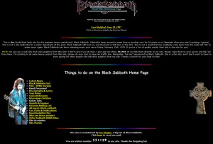
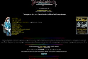
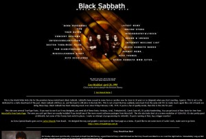
 Below are a couple of shots from the 1997 version of the site. This wasn’t the earliest, but the design is pretty primitive. Makes me wonder what the original 1995 version looked like. I honestly can’t remember at the moment. archive.org claims to have a site capture from December 1996, but when you try looking at it, it shows June 1997, so that’s not correct.
This version of the site had an “intro page”, with just a logo, and a quicktime based music player that played some Sabbath song, although I forget what now. I can’t show that, as I no longer have a backup of it.
This version of the site also used some (now ugly) design elements of the era. This was only 3 years after the web went online in the first place. A lot of people used “paragraph separator images”. That is still used today sometimes (I use one in this story just above), but back then it was mostly these “color bar” kind of things. That was because at this time, we weren’t too far removed from the era where all webpages were grey with just a picture or two. There was no huge multimedia in this day. The site logo was the logo used for Dehumanizer. I also used the “Headless Cross” cross on here. And the old school designs where you had a counter on the front page, as well as the old “Netscape NOW” button; I remember those days. Also, you can’t see it fully, but another old school concept was in play then. The concept of a “Webring“. The bottom most part of the second image shows some of that. I also really liked that image of Iommi to the left of the menu. That stayed there for awhile.
I also used to have a Guitar Tabs section back then, but dropped it because I was never a musician, and I had no idea what made a good tab or a bad one, so I decided not to have those anymore for that reason. Also my site “lyric” was from the Forbidden album – which itself was only about two years old at this point.
1998 Site
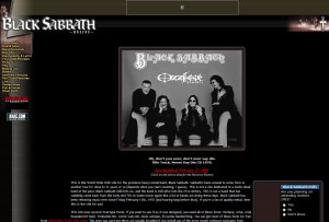
Below is a shot from the 1998 version of the site. The garish rainbow separator lines are gone. This was also my first attempt at some sort of graphical menu. Actually, it wasn’t MY attempt. It was sent to me by a fan of my site at the time. I went with it for awhile, because it looked cool, I thought. Looking back, it wasn’t bad at all, but it was soon replaced. This was due to the fact that most of the rest of the site looked like it did the year before. This wasn’t a radical overhaul, just a nice menu graphic. Most of the rest of the site was still the same. This was borne out by the fact that the “Text based menu” link under the menu just brought up the 1997 menu, the one with the Iommi graphic. I also used frames a lot back then, as they too were the rage at the time. The discography used frames a lot. Kept the list of albums on the left side, and showed content on the right.
Part of the reason I moved away from this version was because one day I looked at the site menu and thought there were too many options. I believe at the time I wanted to show the fact that I had a lot of information available, but I chose a poor way of doing it. Too many menu options. That got streamlined in the next version.
2000 Site – The Primary Look
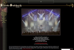
The “2000” version of the site was the one that most people know. This screenshot is the first variant, and Matt’s original design. I hadn’t changed it yet at this point. While this is a more primitive version obviously, you can definitely see the way it ended up in early 2012 here. A few specifics about this one… The site menu wasn’t flash. It was images, that used Javscript to create “hover” versions. A pretty common trick – even today (although today it’s DHTML & Ajax). I also had a java based (maybe quicktime, don’t remember) music player under the menu from hardradio.com – one of the earliest online radio stations, and all metal. They’re still around today.

Of the graphics.. The logo in use here was actually the logo that appears on the Forbidden album. Also in the layout were a few small pics of the band from somewhere on the 1999 Reunion tour. I always meant for those pictures to randomly rotate, but I never got around to that. This version of the primary look was the most primitive, not a lot going on. But in 2000 it was an epic change from what came before it.
2004 – Almost Died
In 2004, I was on another web host, and my site’s popularity was never greater. Unfortunately, due to the fact that I was paying for the monthly hosting fee, I opted for cheap. Black Box was released this year, and really skyrocketed the site’s usage. My host basically told me I needed to find new hosting. They weren’t jerks about it, they gave me fair (and polite) warning. In all honesty, they should have booted me, because I was using my entire month’s allotment of bandwidth in two days. So I started looking around, and dedicated server hosting costs back then were at a price I could NOT afford to pay for myself. The choices were cripple the site beyond a point I wanted to take it just to stay online, or find new hosting.
I was referred to a large webhosting company who (at the time) handled websites for bands like Madonna & U2. So it wasn’t anything small time. However, they wanted to buy the site from me, and then contract hire me back to run it. I think they were shocked when I turned them down, and said “I’d rather take the site offline and let it die than lose control like that”. I’d be beholden to THEM, and if they didn’t like what I did – they’d fire me. Plus they’d own all the content I had built up at that time. No thanks – pass.
I actually came within seven days of the cutoff from my old host, and I was getting desperate. Threw up a Hail Mary. I sent out a long, 3,000 word proposal to a few people asking for help. One of them wrote me back, and told me they didn’t even read the proposal. They asked just one simple question. “Will this move allow you to remain independent”? I said yes, and that sealed it. Said person stepped in and paid for the hosting fees for the site, with one condition. That I never name who they are. So I’m quite grateful to that person for stepping in and allowing me to keep doing my own thing, and keeping me from dropping offline.
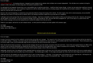
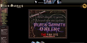
The leadup to almost going offline had me remove several parts of the website to lower my bandwidth usage. I saved a screen capture of that front page. :)
2007 Update
When the band got back together with Ronnie for what became known as the “Heaven & Hell” era, I gave some thought to revamping the website. It wouldn’t have been as drastic as this new 2012 version, but some sort of overhaul. Again, the legacy of the old Frontpage structure killed that off, because I wasn’t willing to manually go through the several hundred pages that comprised the entire site and update it. So I spoke with my (then new) art guy (RedSplat), and threw these thoughts to him. He came up with the idea of doing drop in replacements for the site graphics which massaged the look a little, and updated it.
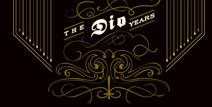
What we came up with was the final incarnation of the site before the 2012 overhaul. Given the graphics were just drop ins for the old structure, it couldn’t be changed that radically. This new one was based off the art direction of the “Dio Years” album. The logo is a lift from there, and the overall theme of the new graphics are based on that album. Especially the cross on the right.
Later additions to this were the rotating collection of front page pictures, a Google Advertisement on the left under the menu, and a Facebook widget – until Facebook took the page from me, anyway.
The final change of any kind structurally to this was in 2009 when “The Devil You Know” came out. The cross on the right was replaced with Henry’s appearance on the cover art in “the 25/41 bible quote circle”.
2012 Overhaul
 I won’t say too much here, as I covered the changes at the top of this news story. However, it is by far the most drastic overhaul I’ve ever taken. It took me almost a year to get it all done, and just about everything has changed. I owe a big debt to Thijs “RedSplat” Leenders. While the new Jan 2012 theme is a purchased WordPress theme, Splat customized it to make it look like what it looks like now. To give you an example, click here to see the theme in it’s default state, and then compare it to the final version in use here. A lot of that is due to Splat’s pixel pushing. He’s quite generous with his time and work to help me out. Site wouldn’t be what it is without him.
Splat had a few words about the 2012 site layout, and it’s relation to the past version of the site. Check this out:
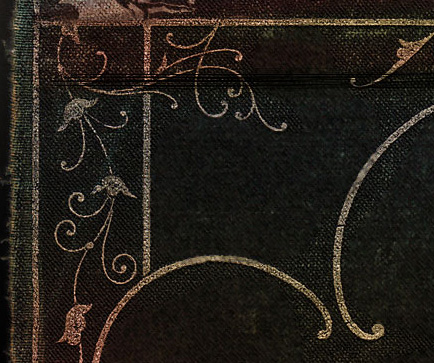
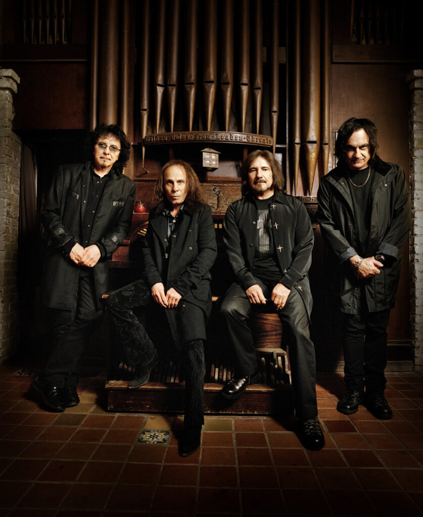
I took my color inspiration for the background site image from that church photo shoot of the band (ed Note: pic at bottom of page). You can tell whenever one of those pictures is on the page. :) The whole site is basically themed by one big image.. But I took colors from the old site theme and band shoot at church. and The Dio Years album had those twirly things. They’d happen to match up with this old book cover stockphoto i used. So i think it is all a nice evolution.
Here’s a few shots showing the “twirly things” he’s talking about. The first is the bottom of the Dio Years cover art, then you’re looking at part of the swirly stuff from the now replaced version of the site, and finally the swirly bits from the new version.

I also owe a lot to Bryan Turner & Michael Preslar of Pegasus Hosting. Thes are the guys who are tired of hearing me come to them when there’s some server issue. There’s a ton of people to thank, I suggest you take a look the site’s credits & thanks page. I list a lot there.
I guess that’s about it. Thanks for visiting, and let me know what you think of all of this.
God Bless,
Joe Siegler

looks good Joe, good job.
Great stuff! You did realy good, Joe.
Congratulations.
Been coming here since 1998 still the best band site EVER!
Keep up the good work!
parabéns Joe, ficou muito bom!!!
hey man! very, very good job on all the incarnations of black-sabbath.com – I’ll tell you man, it f***** rules!
When I was a kid I had nowhere to look up for data on sabbath since they did not have a site of their own and detailed info was nowhere to be found… so I stumbled into one of the earliest versions of the site and got my share of knowledge about one of the greatest bands alive(it’s 18th of january when I’m writing this and Iommi’s health is still on the line – hope that changes very soon).
so anyway, I got tickets to see them in belgrade and wienna, and in hope of iommi getting up on his feet real quick I’m sending you my deepest appreciation of your work on this magnificent site. Keep it up. Rock on
Gojo, City of Rijeka, Croatia
Nice work, Joe! Keep it independent. We all appreciate it.
I always considered myself lucky to have Sabbath as my favorite band because of this website. It has so much well researched and recorded data and up to date news. This is truly the best and most accurate fan site of any other fan site in history.
Hey Joe,
Great new look!!!! I’ve been a sab fan for most of my life. I’ve been coming to your site for probably ten years now. Always returning to find out what’s new in the Sabbath world and you always seem to be the first to know. Your like the digital member of the band in some way or another and that makes you just as awesome as they are!!!! You rock dude, keep up all of the good work that you do!!!!
Hey, new site looks great :) better than older version… maybe I shoud think abou some changes on my polish Black Sabbath website.. Greetings!
Hello Joe,
I remember seeing your new website in 2000, and that one looked great. Now, 12 years later this one looks even better! The website looks great, well done! Also, thank you for all the great information and updates over the years. You’re the #1 source of Sabbath info! Congrats on the new website, and keep up this great work, we all appreciate your dedication to the band. Thanks!
Well, i thinck you are fantasic JOE!!!!!!!!!!!!!!!!!!!!
Thancs from SWEDEN!!
Sorry for my bad englisch../
New site looks great Joe! Thanks a lot for putting such good, hard work into it.
Hello Joe! I have been following the site since 2005 or so and let me tell you, that there’s no way a Sabbath site could be better than yours. This will forever be my ‘Official Black Sabbath Online Home Page’ and I guess I’m not alone. Love the new look and feel. If you don’t mind (do let me know if you do), I’ll make an offline copy of it, because one never knows + we wouldn’t want to lose all this great info, now would we :D !
Massive ‘thumbs up, Joe!
You ARE Sabbath’s online community.
It looks great and functions great. Sorted.
Great new look Joe! Can’t wait to browse through all of it.
Joe,
Just need to express my appreciation for your dedication and sacrifice. in this day in age, you are the “sixth member” of Black Sabbath. (For those of you scratching your head, the mystical “fifth member” is a non-physical entity that Bill Ward has referred to).
Thank You Joe!!!!
great re vamp,a lot more some to view,good on ya joe..cheers!!!
great new upgrade,a lot more stuff to view,good on ya joe!!!
great new upgrade,love the new site,well done joe,cheers!!!!
Awesome job! Looks absolutely fantastic! 2 Thumbs up!
Greetings from Romania! Congratulations for the new site! Looks great.
Здравствуйте!!! Передайте пожалуйста чтобы он прочитал моё послание на myspace.Это очень важно
How can I get a hold of Ozzy himself? I hear Sabbath (the original sabbath) is actually coming out with an album this fall, and I have the BEST album name that they should name this one.
At least your site didn’t cut Bill Ward out of all the old photos, like the brand new “official” Black Sabbath site did. What a disgrace. It looks like they were a 3 piece band in the ’70s. I’m sickened by what they have done.
@ Narin The Squtz
You do know that Bill Ward himself requested that he be removed from the photos, right?
Good page ! i really enjoyed it.
i’m looking for some news about Iommi the band or the upcoming album since 1978.
Im so curios If producer Rubin,it gotto give us,to immitate that sound of the first 3 albums.
God Bless you man.
Ozyy believed in me,when I was featured in his fanart gallery,way back in 1999.it changed my life.
since than i made a few metal gods too like Dio Alice Cooper and rob Zombie, i felt to create surreal portrets always listening to their albums, Ibecame a Rock Surrealist,and my hobby is becomming my lifework as long as i live since then
I got a few artworks whats Ozzy Osbourne and DIO and Black sabbtath inspired fantasies influecend,very interesting to see ,I want to give a feeling of sentament and darkness like the goood old days
I also want to cheer Iommi up by making a portret ? i want to send him a poster version t bless him an wish health and inspiration.
I need a good photo.contact me if you own a good one
i gonna surf around your page take care
-DAnny
Check out this new Black Sabbath the birth of Heavy Metal – insanely good http://www.vice.com/en_uk/on-the-road/on-the-road-black-sabbath-and-the-birth-of-heavy-metal
Thank you very much for your work on this site. All Black Sabbath fans of the world , we owe much.